


Most Facebook creative advice hasn't changed since 2019: bright colors, clear CTA, test a few variations. The feed itself has changed completely. Advantage+ campaigns now handle targeting decisions that used to require manual adset segmentation, Reels placements dominate impression share, and Meta's algorithm rewards creative that looks organic over creative that looks like an ad. If your 2023 playbook is still your 2026 playbook, you're paying a tax on every impression without knowing it.
Why 2026 Creative Rules Are Different
Three structural shifts drive the change. First, Advantage+ Shopping Campaigns absorb far more ad variations inside a single adset than the old test-then-scale model ever allowed, so the bottleneck isn't audience segmentation anymore. It's creative supply. Second, organic-feeling content wins the auction on its own merits: ads built from existing organic post IDs carry social proof (comments, shares, view counts) that lifts Estimated Action Rate, Meta's proxy for how likely a user is to engage. Third, feed scroll velocity keeps climbing. Users move past posts fast enough that you have almost no room to warm up a viewer. The hook has to work as a filter in the first three seconds, not an introduction.
Put together, the winning accounts in 2026 aren't the ones with the single best-designed ad. They run structured creative testing at volume, feed Meta's algorithm enough raw variation to find what works, then double down fast. If you haven't formalized that process, our creative testing framework for 2026 is the logical starting point before you touch a single design template.
The Anatomy of a High-Converting Facebook Ad Creative
Strip away format and every winning ad on Facebook shares the same four components, in this order of importance:
- The hook. Whatever stops the thumb: a visual pattern interrupt, a jarring first line of copy, or an unexpected opening frame in a video.
- The proof point. A specific, credible reason to believe: a number, a before/after, a real customer quote, a demo.
- The offer clarity. What you get and what it costs, stated plainly enough that someone skimming at 2x speed still absorbs it.
- The CTA. One clear next action, repeated in both the visual and the copy so it survives sound-off viewing.
Where teams go wrong is optimizing component four (a punchier button, a new CTA verb) when the real leak is in component one. If your hook isn't earning attention, nothing downstream matters. Work through that diagnostic order every time performance dips.
The point: A weak hook can't be fixed by a stronger CTA. Diagnose top-down, not bottom-up.
Static Image Ads: Specs, Ratios & Design Principles That Still Win
Static isn't dead. It's been repositioned. In feed placements, 1:1 and 4:5 crops still outperform 16:9 because they occupy more vertical real estate on mobile, which matters more given how fast people scroll. But the design language that wins has shifted away from polished studio photography toward something closer to a phone screenshot: a genuine product photo, a text overlay that looks hand-typed rather than brand-templated, a screenshot of a review or DM. Design principles that consistently hold up:
- Contrast over polish. A slightly rough, high-contrast image with a bold single claim outperforms a beautifully lit lifestyle shot with soft copy.
- Text placement in the top third. Meta's feed crops and UI elements (like/comment icons, sponsor tags) eat into the bottom of the frame on many placements. Keep your core claim above that zone.
- One idea per image. If you need a caption to explain what the visual means, the visual has already failed. Save layered messaging for carousels.
- Labeled UGC and influencer content. Meta's own guidance is explicit: creative sourced from real customers or creators should read as such, not be dressed up as brand photography. The trust signal is the point.
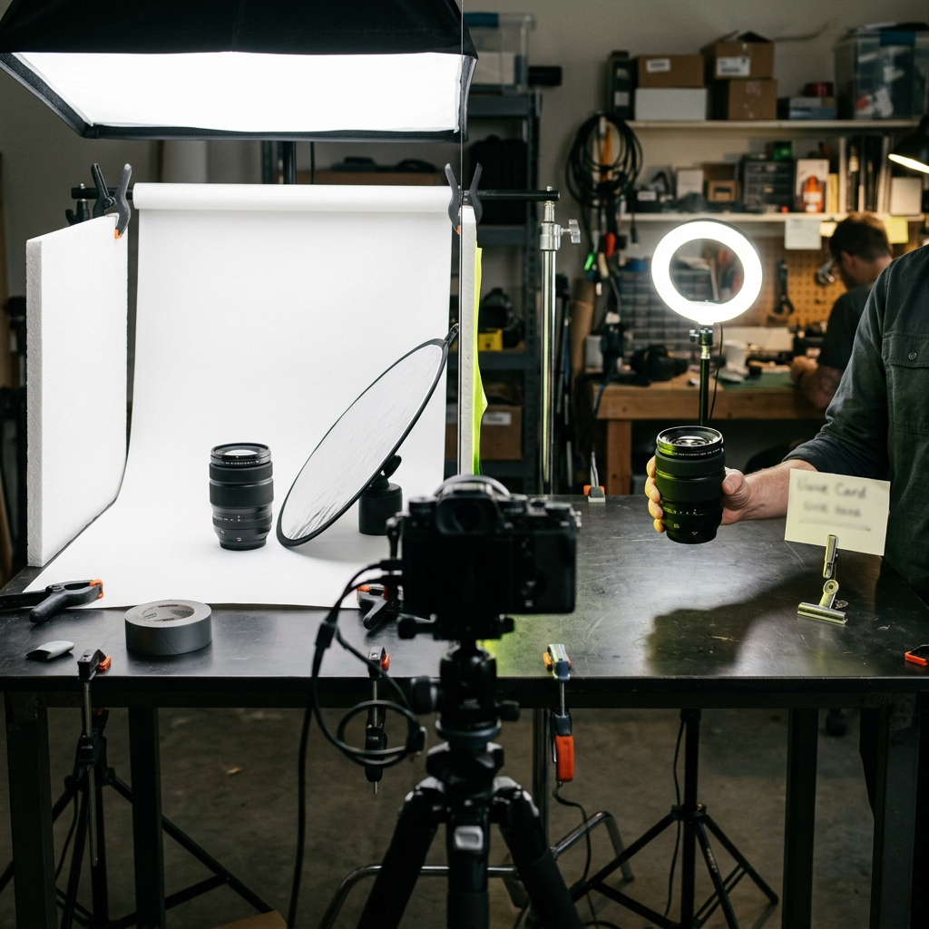
| The old way | The better way |
|---|---|
| Studio-lit product shot with brand-style headline overlay | Real customer photo or screenshot, hand-typed-style caption, one claim |
| 16:9 landscape crop reused everywhere | 1:1 or 4:5 built natively for each placement |
| Message buried under decorative copy | Single, unmissable claim in the top third of frame |
Static ads that mimic organic content tend to out-earn polished brand photography in 2026 auctions.
Video & Reels Ads: Hook Timing, Captions & Native-Feel Principles
Video, and Reels specifically, is where impression share has consolidated. The physics of the hook matter most here, because you're competing against genuinely organic content in the same feed, using the same aspect ratio and the same shaky handheld camera work. If your video ad looks like an ad, the algorithm and the user both penalize you. Rules that hold up across accounts right now:
- Native vertical, not repurposed landscape. Shoot or edit for 9:16 from the start. A letterboxed 16:9 video crammed into a vertical frame reads as an ad instantly.
- Front-load the pattern interrupt. The first frame should not be a logo, a slow zoom, or a title card. Open mid-action, mid-sentence, or on an unexpected visual.
- Design for sound-off. Captions are not optional. Most Facebook and Instagram video is watched muted, so your hook and your offer both need to land visually and in text.
- Keep raw, low-fidelity footage in rotation. Overly produced video, complete with motion graphics and a professional voiceover, increasingly underperforms against a founder talking straight to camera or a customer's own unboxing clip.
The hook itself deserves scrutiny. It's not about being loud in the first frame. It's about matching one of a handful of proven psychological patterns: curiosity gap, direct callout, unexpected claim, social proof flash. For a structured way to generate and categorize these, our breakdown of Facebook ad hooks goes deeper into the mechanics than "make it attention-grabbing" ever will.
On Facebook in 2026, the ad that looks least like an ad usually wins the auction.
Carousel & Collection Ads: When Sequence Storytelling Pays Off
Carousels get underused because they're harder to brief than a single static or video. But they solve a real problem: layered messaging that a single image can't carry. Use a carousel when your offer genuinely benefits from sequence, not because you have five product photos to fill slots. Situations where the format earns its keep:
- Problem-agitate-solve narratives, where card one states the pain, card two builds tension, card three introduces the fix.
- Multi-SKU catalogs where each card is genuinely a different product, not five angles of the same one.
- Before/after or step-by-step demonstrations, where the swipe motion itself mirrors progress through a process.
Collection ads (the instant-storefront format) still perform well for ecommerce accounts with a real catalog feed, but they need clean product imagery and accurate pricing synced via Conversions API or your commerce feed. Otherwise the instant experience undercuts trust rather than building it.
Copy + Creative Harmony: Writing Headlines That Match Your Visual
A disconnect between what your image promises and what your headline says is one of the most common and least diagnosed reasons ads underperform. If your visual hook is a jarring before/after transformation, your headline needs to reinforce that specific claim, not pivot to a generic brand tagline. Copy and creative should function as one hook delivered through two channels at once, so that a sound-off, half-attention scroller still gets the full message. A few copy principles that pair well with the visual approaches above:
- Match tone: raw, UGC-style visuals need conversational, imperfect copy, not polished brand voice.
- Lead with the same claim the image makes. Don't introduce a second idea in the headline.
- Keep primary text short enough to read in a glance, then let the description field carry supporting detail for those who tap in.
If you're rebuilding your copy process, work from established structures rather than freehanding every headline. Our guide to Facebook ad copywriting frameworks lays out several proven patterns you can pair directly against the visual principles above.
Creative Fatigue Signals: How to Spot Them Before ROAS Drops
Fatigue rarely announces itself as a cliff. It shows up first as a slow drift: frequency creeping past 2-3 within a single adset, CPM ticking upward while CTR softens, cost per result rising a little each week even though nothing else in the account changed. By the time ROAS visibly drops, the creative has usually been decaying for two to three weeks. The teams that catch it early watch leading indicators, not lagging ones:
- Frequency relative to audience size. A frequency of 3+ in a broad Advantage+ audience is a different signal than the same frequency in a narrow retargeting pool.
- CTR decay week over week, even if CPA hasn't moved yet.
- Comment sentiment shift, where "seen this ad everywhere" comments start appearing under an otherwise stable post.
Because many accounts hit meaningful fatigue within about four weeks at moderate to high spend, the real fix isn't waiting for a lagging ROAS signal. It's building a refresh cadence that gets ahead of it. We go deeper on the specific thresholds and diagnostic checklist in our dedicated piece on Facebook ad fatigue.
Key takeaways
- Diagnose creative top-down: hook first, then proof, offer, and CTA, never the reverse.
- Native-feeling, slightly rough creative is now outperforming polished brand photography across static and video.
- Fatigue is a four-week clock in many accounts, so refresh on a cadence rather than reacting to a ROAS drop.
Your 2026 Creative Refresh Cadence Checklist
Structure beats improvisation. A workable cadence for most accounts spending at moderate to high volume looks like this:
- Weekly: pull frequency and CTR trend by ad, flag anything showing early decay.
- Every 2 weeks: launch a new batch of 8-12 creative variants across your top 2-3 angles, mixing static, video, and carousel.
- Every 3-4 weeks: retire the bottom 30-40% of active creative by cost per result, whether or not it's technically still working.
- Monthly: run a Challenger ASC batch using the top variants that tested well but didn't scale from their original adset, giving them a second shot in a less crowded environment.
- Quarterly: revisit your core angles entirely. If the same three hooks have anchored your account for six months, research what's working elsewhere in your category and build genuinely new concepts, not new edits of old ones.
None of this requires a bigger budget. It requires a system. The accounts winning in 2026 aren't spending more on production. They're producing more variation, testing it faster, and retiring losers before fatigue shows up in the ROAS line. Build the cadence once and the rest of the work becomes mechanical.
Put this into practice
Generate on-brand Meta ads — angles, formats, hooks and copy — in minutes.
Start freeFrequently asked questions
Many accounts show fatigue signals within 2-4 weeks at moderate spend, so plan a rolling refresh of 30-50% of active creative every 3-4 weeks rather than waiting for a full ROAS collapse.
On Reels and Stories placements they often do, since native vertical framing reads as organic content. But square and 4:5 still hold up in the main feed, so test both rather than defaulting to one ratio.
Treating creative testing as one-and-done. Teams launch a handful of ads once and never structurally isolate which hook, format, or angle actually drove the result.
Keep reading
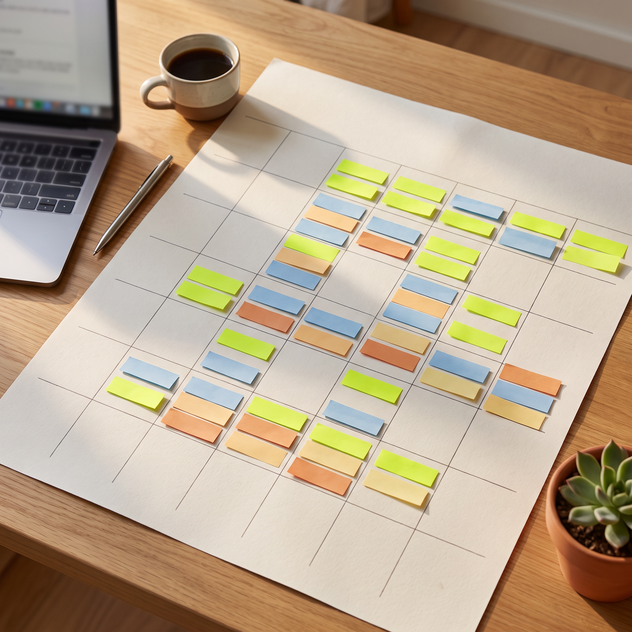
How to Build a Facebook Ads Creative Calendar That Prevents Fatigue
A tactical system for planning hooks, angles, and refresh cadence so creative fatigue never catches your account off guard.

Advantage+ Creative Isn't Working for Your Brand? Here's How to Fix It
A troubleshooting guide to finding out why Advantage+ creative underperforms or looks off-brand, and which settings to change.
How to Scale Facebook Ads from $100/day to $1,000/day Without Creative Burnout
A phased framework for scaling Facebook ad budgets tied to creative supply, testing cadence, and fatigue signals, not just bid strategy.