
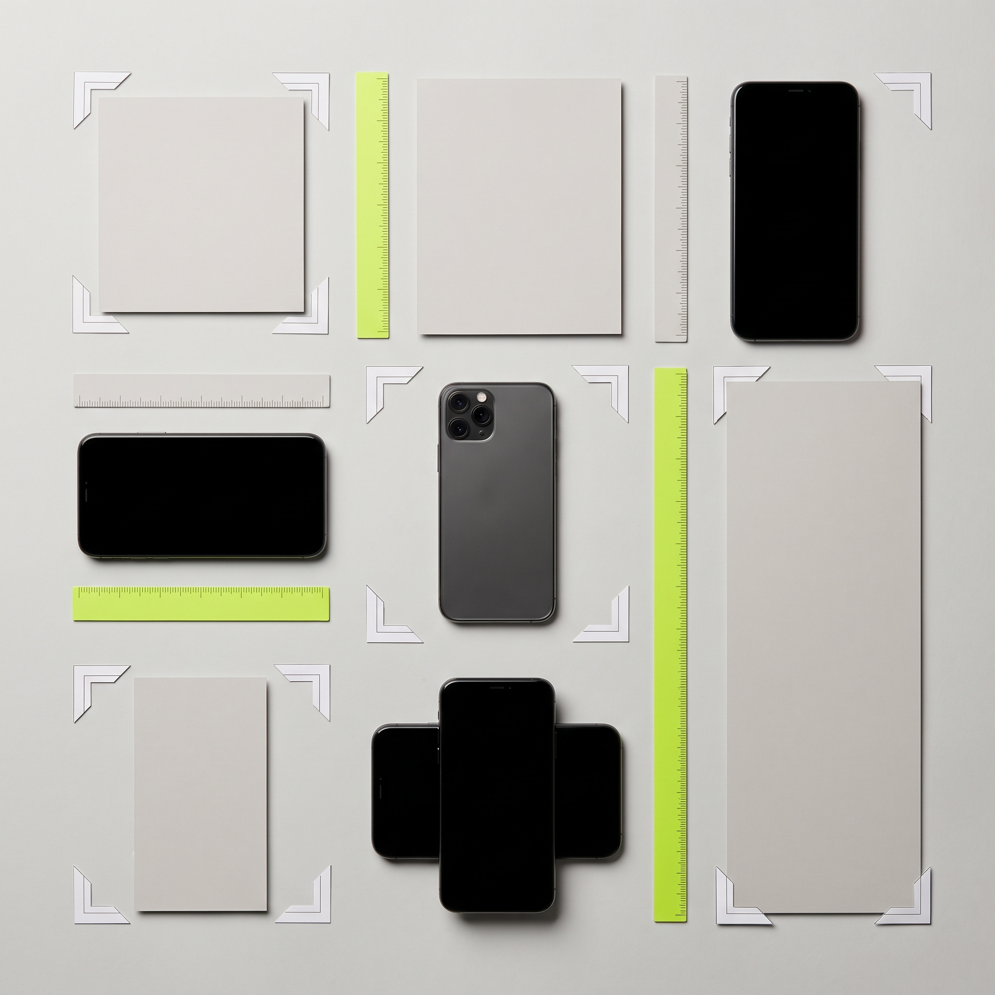
Every performance marketer has shipped a creative that looked perfect in the editor, then watched it render cropped, pixelated, or pillarboxed the moment it hit a live placement. That's not a targeting problem or a bidding problem. It's a specs problem, and it's entirely avoidable. Meta's placement inventory keeps shifting, Advantage+ now auto-distributes creative across more surfaces than ever, and the gap between "technically approved" and "actually looks good" has widened going into 2026.
This is a working reference, not a theory piece. It's organized the way a creative producer actually needs it: by placement, with the exact pixel dimensions, aspect ratios, safe zones, and file limits you'll hand to your design team or feed into an AI ad generator before a single dollar goes into Ads Manager.
Why Specs Still Matter in the Advantage+ Era
Advantage+ placements distribute your creative across Feed, Stories, Reels, Marketplace, and the Audience Network based on where Meta's system predicts it will perform. That's efficient for delivery, but it means one static 1:1 image can end up squeezed into a 9:16 Reels slot with ugly letterboxing if you don't supply the right aspect ratio for each surface. The system uses whatever you give it. It won't reformat a square image into a vertical one that looks intentional.
So you no longer design "an ad." You design a small asset set, typically two to four aspect ratios, and let Meta's delivery engine match the right crop to the right placement. Get the underlying dimensions wrong and every downstream placement inherits the problem.
The point: Two properly built assets, a 4:5 for Feed and a 9:16 for Stories/Reels, cover the large majority of Advantage+ delivery. Everything beyond that is optimization, not necessity.
Quick Reference: Core Ad Sizes by Placement
Here's the cheat sheet worth pinning above your desk. These dimensions and file limits hold across Facebook and Instagram as of 2026.
| Placement | Aspect Ratio | Recommended Resolution | File / Size Limit |
|---|---|---|---|
| Feed image (FB & IG) | 1:1 or 4:5 | 1080×1080 / 1080×1350 | JPG/PNG, 30MB |
| Feed video | 1:1 or 4:5 | 1080×1080 / 1080×1350 | MP4/MOV, 4GB |
| Stories | 9:16 | 1080×1920 | Image 30MB, video 4GB |
| Reels | 9:16 | 1080×1920 | MP4/MOV, 4GB |
| Carousel (2-10 cards) | 1:1 | 1080×1080 | JPG/PNG 30MB, video 4GB |
| In-stream video | 16:9 or 1:1 | 1920×1080 | MP4/MOV, 4GB |
| Right column | 1:1 | 1080×1080 | JPG/PNG, 30MB |
| Marketplace | 1:1 | 1080×1080 | JPG/PNG, 30MB |
Minimum resolutions run lower than these (as low as 600×600 for square, 500×889 for vertical), but designing at the recommended resolution avoids compression artifacts on high-density displays.
Feed: Still the Default, Still the Workhorse
Facebook and Instagram Feed remain the highest-volume placements for most advertisers, and with most traffic on mobile, square and vertical formats have all but replaced horizontal 16:9 assets here. The 1:1 square (1080×1080) is the safest default: it fills more of the mobile screen than landscape and survives the crop into most secondary placements without major loss.
Build 4:5 (1080×1350) as a second asset wherever budget allows. It occupies more vertical screen real estate in-feed, which tends to slow the scroll and improve thumb-stop rate, particularly for video.
Feed Video Specifics
Feed video supports the same 1:1 or 4:5 ratios, MP4 or MOV files up to 4GB, and durations from 1 second to 240 minutes, though in practice anything past 15 to 30 seconds sees steep drop-off for cold-audience prospecting. Captions are non-negotiable; a large share of Feed video plays with sound off by default.

Stories and Reels: Design Vertical, Design for Thumbs
Stories and Reels both require 9:16 (1080×1920) and share the same full-screen, edge-to-edge mobile experience. The critical detail isn't the outer dimension, it's the safe zone. Both placements overlay UI elements (profile name, caption stickers, CTA button, progress bar) on the top and bottom of the frame, roughly 14% at each end. Any text or logo placed in those zones risks being covered.
- Build at full 1080×1920. Never stretch a square asset into vertical; it reads as low-effort and drags down engagement.
- Keep key messaging in the center of the frame. The middle stays clear of UI overlays on both platforms.
- Front-load motion or a face in the first second. Reels and Stories autoplay silently and scroll fast; static opening frames get skipped.
- Caption everything on-screen. Assume sound-off consumption; it's the default, not the exception.
Carousel and Collection Formats
Carousel ads support 2 to 10 cards, each built at 1:1 (1080×1080), with the same 30MB image / 4GB video limits as standard Feed placements. Carousel stays underused relative to what it can do. It's one of the few native formats that lets you test angles inside a single ad unit, since each card carries its own headline, description, and destination link.
Collection ads pair a cover image or video with a grid of product cards beneath it, built specifically for catalog-driven ecommerce. If you're running Advantage+ shopping campaigns, Collection tends to beat single-image static for product discovery because it mimics a mini storefront inside the Feed.
In-Stream, Right Column, and Marketplace: The Overlooked Placements
In-stream video ads, the pre-roll and mid-roll units inside longer-form video, default to 16:9 or 1:1 at a recommended 1920×1080. They get less creative attention than Feed and Reels, but they're worth building for if your video budget is meaningful, since they reach a viewer already in a video-watching mindset.
Right column and Marketplace both use 1:1 at 1080×1080 but tolerate much lower minimum resolutions (down to 254×133 for right column). These are legacy, low-cost placements that Advantage+ fills opportunistically. They don't warrant custom creative, but your square Feed asset should be clean enough to hold up when heavily downscaled.
The Old Spec-Guessing Workflow vs. the Reference-First Workflow
| The old way | The better way |
|---|---|
| Design one 1:1 asset, hope it displays fine everywhere | Build 4:5 and 9:16 variants upfront, covering the bulk of Advantage+ delivery |
| Add logo/CTA text anywhere on the canvas | Keep all key elements inside the center safe zone for Stories/Reels |
| Reuse a TV-style 16:9 video for Feed and Reels | Cut a native vertical version; never stretch or letterbox existing footage |
| Discover cropping issues after the ad is live | Preview every placement in Ads Manager before publishing |
Spec compliance is a pre-launch checklist item, not a post-mortem.
The algorithm can't fix a creative that was never built for the screen it's about to appear on.
File Size, Duration, and the Details That Get Overlooked
Beyond aspect ratio, a handful of technical limits trip up even experienced media buyers:
- Video length: Feed and in-stream tolerate up to 240 minutes, but performance drops sharply past 30 seconds for cold prospecting; Stories and Reels tend to perform best under 15 seconds.
- File size caps: 30MB for images, 4GB for video, across nearly every placement. Compression artifacts from over-optimizing file size hurt perceived quality more than the marginal load-time gain helps.
- Minimum resolution: Ads Manager accepts images as small as 600×600, but anything below the recommended resolution renders soft on high-density phone screens, which quietly suppresses engagement.
- Text-on-image ratio: Meta no longer hard-blocks text-heavy images, but creative overloaded with text overlay tends to see throttled delivery and higher CPMs relative to clean, minimal-text visuals.

Building an Asset Set That Doesn't Require Constant Rework
Standardize on a small production matrix instead of custom-building for every placement. One campaign concept, executed as a single 4:5 static, one 9:16 static, and one 9:16 video cutdown, covers Feed, Stories, Reels, Marketplace, and right column without a single extra design pass. Add a 1:1 carousel version if the product has multiple SKUs or use cases worth showing side by side.
This is where AI-assisted ad generation earns its keep. Instead of manually resizing and re-composing the same message five times, a tool that understands placement-specific safe zones and aspect ratios can output the full set from one creative brief, cutting the production cycle from days to minutes.
Key takeaways
- Two core assets, 4:5 for Feed and 9:16 for Stories/Reels, cover the vast majority of Advantage+ delivery in 2026.
- Keep essential text and logos in the center of vertical frames; UI overlays cover roughly the top and bottom 14% of Stories and Reels.
- Never stretch or letterbox existing footage into a new aspect ratio; native cuts consistently outperform resized ones.
Final Word
Specs are the least glamorous part of ad production and the easiest to get right once you build the habit of checking placement previews before launch. Meta's own ads guide stays current on minor dimension shifts, so check it when you're building a new campaign template. But the fundamentals here, 4:5 for Feed, 9:16 for Stories and Reels, center-safe messaging, and native vertical video, will hold steady through most of 2026's placement changes. Build to spec once, reuse the template forever.
Put this into practice
Generate on-brand Meta ads — angles, formats, hooks and copy — in minutes.
Start free